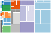
I came across a simple visualization of England and Wales mortality data in the Guardian. And because I couldn’t deal with the network-y display of hierarchical count data, I decided to redesign the graphic as a tree map. In googling for “treemap”, I found d3.js, which makes extremely attractive Javascript graphics, with a number of rather fancy built-in figure types. It seems a little harder to get into than Processing, as it exposes more of the raw Javascript, but the results are beautiful and it provides full SVG support. Here’s the mortality data laid out with d3’s treemap algorithm.