Why do we get sick from the flu or SARS-CoV-2 so many times in our lives?
As I write this, I’m getting over a week-long cold caused by some virus that probably wasn’t SARS-CoV-2 (the only virus I can test for at home). The odds are good that it was a type of virus like the seasonal flu that has infected me before and that has now managed to escape my existing immunity. This kind of reinfection happens all of the time. Viruses exist only because they succeed in accomplishing two main goals (Figure 1):
- make more copies of themselves
- transmit from one host to another
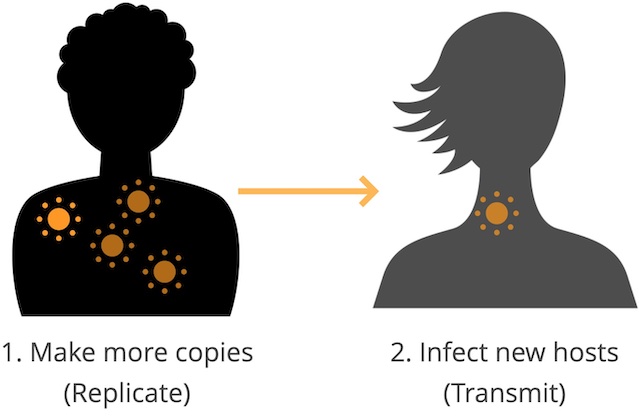
When a virus infects us, it makes many more copies of itself with a pretty terrible copy machine that makes mistakes or “mutations” with each copy. The new mutated copies are still close enough to the original to be considered the same type of virus (like seasonal flu) but different enough that our immune systems may not recognize them.
When we sneeze or cough in an elevator and transmit one of those mutated copies to someone else, the copy could look different enough to that person’s immune system that the virus can infect them again, make more copies of itself with more mutations, and then transmit again to someone new. For a prettier visual explanation of this process, check out Jonathan Corum’s and Carl Zimmer’s beautiful article about how coronavirus mutates and spreads.
What can we learn about mutations we find in viruses?
As a virus researcher in Trevor Bedford’s lab at the Fred Hutchinson Cancer Center, I spend a lot of time thinking about these viral mutations. For example, when we find a lot of seasonal flu viruses with the same mutation that allows those viruses to reinfect a lot of people in the world, we can usually track that mutation back to a single common ancestor of all those recently successful virus copies. For SARS-CoV-2, these groups of successful virus copies tend to get names like “Delta” or “Omicron” or “JN.1”.
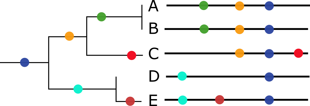
Most of the time, we can use the collection of mutations that each virus has to build a family tree of all the virus copies we’ve observed in the world. These virus trees work because we assume that each new virus copy descended from a single parent copy. When we see the same mutations in two copies of a virus, we can calculate the chance that they came from the same parent (Figure 2). These family trees of viruses shows us which common ancestors of recent viruses were the most successful and which mutations were associated with that success. Virus researchers use this kind of information to decide whether enough mutations have occurred to require an update to vaccines like the seasonal flu or SARS-CoV-2 vaccines.
Unfortunately, it is possible to get infected by multiple copies of the same type of virus at the same time. When this infection by multiple copies happens, the different infecting virus copies can make new copies of themselves in the same place in our bodies and accidentally include bits of each other in the new copies. These bigger changes in the new virus copies break the rules that allow us to make virus family trees and they happen often enough that researchers have spent a lot of time making new computational tools to make family trees for viruses that have multiple parents.
Could we find groups of related flu viruses without building a family tree?
In the Bedford lab, we recently stumbled on a new approach to find groups of virus copies that share the same mutations no matter how many parents they have and without building a family tree at all. This approach was a long time in the making, though, and started in July 2019 when a rising junior in high school, Sravani Nanduri, joined the lab for a 2-month summer internship under the joint mentorship of Alli Black and myself. Sravani already knew how to write computer programs, but she wanted to learn more about programming and data visualization for biology.
Her internship project came from an idea Trevor had: what if, instead of building family trees of viruses based on their shared mutations, we could put viruses on a two-dimensional map where the distances between each pair of viruses reflected the mutations that differed between them?
We had a lot of questions for a 2-month internship project: How would we build these maps? Would the same groups of viruses we see in a tree place together in the maps? What would the distance between any two virus copies actually mean on one of these maps? How would we visualize these maps? What would be the most fun bits of this project for Sravani to work on? Sravani, Alli, Trevor, and I ended up sketching out the following example of what a final visualization would be for the project (Figure 3), with the idea that Sravani would apply a couple of well-known methods to one type of virus and plot the resulting maps for each method alongside the tree of the same virus copies.
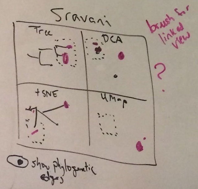
To make the project more interesting from a data science perspective, we agreed that the visualization should be interactive, so we could select viruses in the tree or one of the maps and the same viruses would get highlighted in the other panels of the figure.
Over 2 months, Sravani learned how to:
- work with virus mutation data
- build virus trees from mutation data
- calculate distances between pairs of virus copies based on their mutations
- make two-dimensional maps from mutation data using methods with exciting names like principal components analysis (PCA), multidimensional scaling (MDS), t-distributed stochastic neighbor embedding (t-SNE), and uniform manifold approximation and projection (UMAP)
- plot trees and maps in a single interactive figure that allowed us to highlight bits of the tree or a map and see the same viruses in the other parts of the figure
By August 2019, Sravani had made the prototype below (Figure 4) from mutations in a type of seasonal flu called “H3N2” which causes the most hospitalizations and deaths each year.
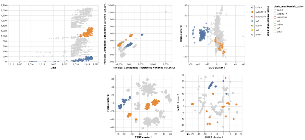
The prototype revealed some interesting patterns:
- Most of the maps placed pairs of viruses with the same mutations closer together than pairs with different mutations.
- Some of the maps (like MDS’s) actually acted like a real map with the distance between viruses on the map matching exactly the number of mutations that differed between those viruses.
- Other maps (like t-SNE’s) didn’t act like real maps, but they tightly clustered similar viruses into groups in the same space where we could easily find those groups by eye.
- The groups of viruses in these maps often matched the groups we had already defined in the tree.
Sravani and I were excited enough about these results to agree that we should keep this project going a little longer. In October 2019, we decided to meet once a month while Sravani refined the prototype above and drafted a short summary of the results in the form of a scientific paper that we could post online somewhere.
Can we find groups of related flu viruses when we can’t build a family tree?
Sravani and I continued to meet monthly through the beginning of the SARS-CoV-2 pandemic, she learned how to write a scientific paper, wrote the first full draft of a paper, and referenced this work in her college applications. By June 2023, we’d both been busy with other projects. Sravani had been focused on class work as an undergraduate in the University of Washington’s Computer Science program. I had been working with the Nextstrain team on pandemic response efforts. Despite our other commitments, Sravani was eager to revise the original paper and publish it in a scientific journal.
We decided to focus on two viruses (seasonal influenza H3N2 and SARS-CoV-2) and the original four methods of making maps (PCA, MDS, t-SNE, and UMAP). We wanted to measure how well the groups of viruses that we found in these maps matched the groups from family trees that experts had already identified for flu and SARS-CoV-2. We found that groups from t-SNE quite closely matched the expert group definitions for both flu and SARS-CoV-2, as shown by the figure below where flu viruses are colored by their expert-assigned groups (Figure 5).
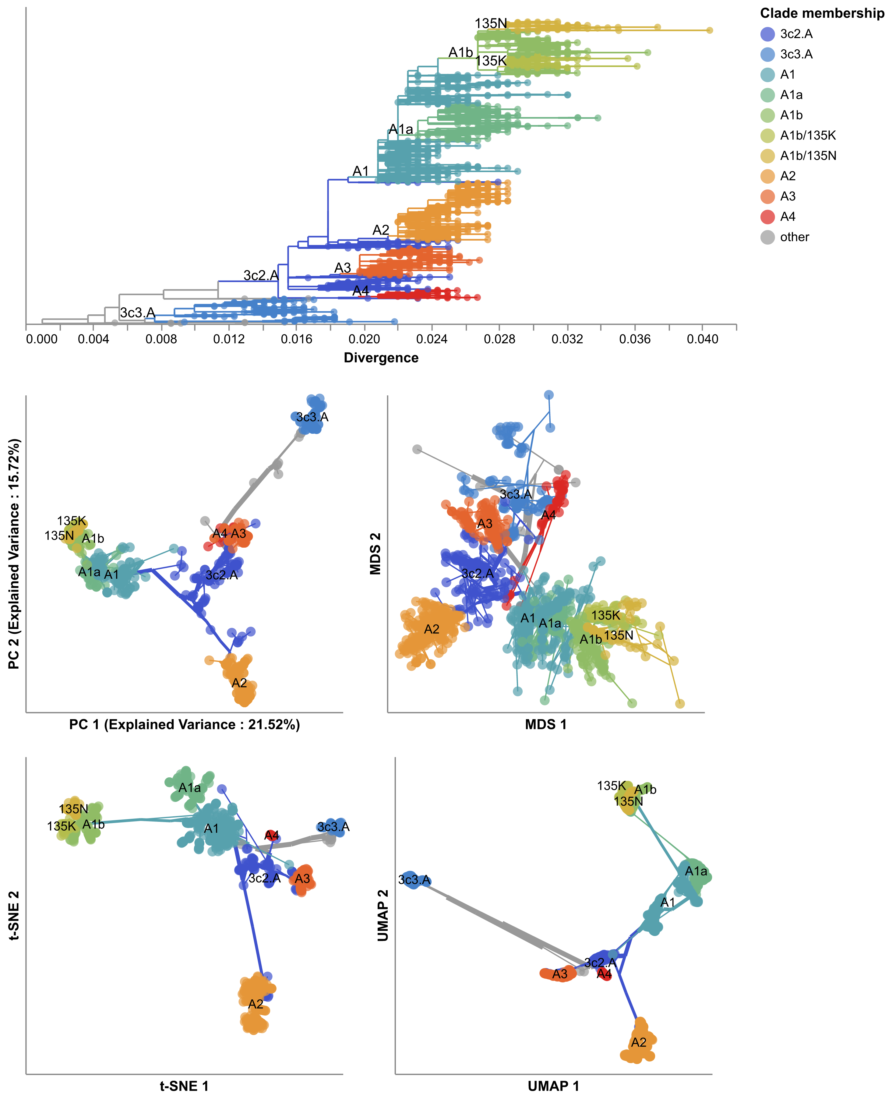
These results suggested that we could use these maps of viral mutations to automatically define new, meaningful groups of viruses that could be reviewed by experts instead of requiring experts to manually define these groups. This result was surprising because the methods we use to make these maps have no understanding of virus evolution; they only have a sense of how many mutations are shared or not between pairs of viruses.
We also realized we could make maps from viruses that had multiple parents even when the standard methods to build family trees wouldn’t work. For example, each flu virus is made up of 8 separate pieces that need to get bundled together to make a complete virus. When we get infected by a single flu virus, that virus will make copies of all 8 pieces and its child viruses will get those copies from the same parent. When we get infected by more than one flu virus at the same time, those viruses can accidentally swap some of their 8 pieces such that parts of their child viruses come from different parents. (Scientists call this swapping process “reassortment”.) This accidental swapping of viral pieces means that we normally have to make separate family trees for each of the 8 pieces because the methods to make family trees assume that each virus piece comes from a single parent. To build a family tree that allows for multiple parents, researchers have developed more sophisticated methods that try to work out which of the 8 pieces for each virus belong to which parent.
The map methods we used in this project didn’t know anything about virus biology and didn’t make any assumptions about how many parents each virus had. As a result, we figured we could easily build maps from multiple viral pieces at once to find meaningful groups that would otherwise require more complicated methods to find. To test this idea, we used a newly developed method, TreeKnit, written by Pierre Barrat-Charlaix and Richard Neher that uses the theoretical concepts of virus evolution to make family trees of seasonal flu that allow each virus to have more than one parent. This method requires us to make a separate family tree for each viral piece and then it finds the groups of viruses that most likely have the same parents across all viral pieces. Figure 6 below shows an example output for two pieces of seasonal flu. The family tree on the left is for a piece called HA and on the right is a piece called NA. The lines connect the same viruses in the left tree to the right tree. The colors show the groups that TreeKnit calculated as most likely descending from the same parent for both pieces.
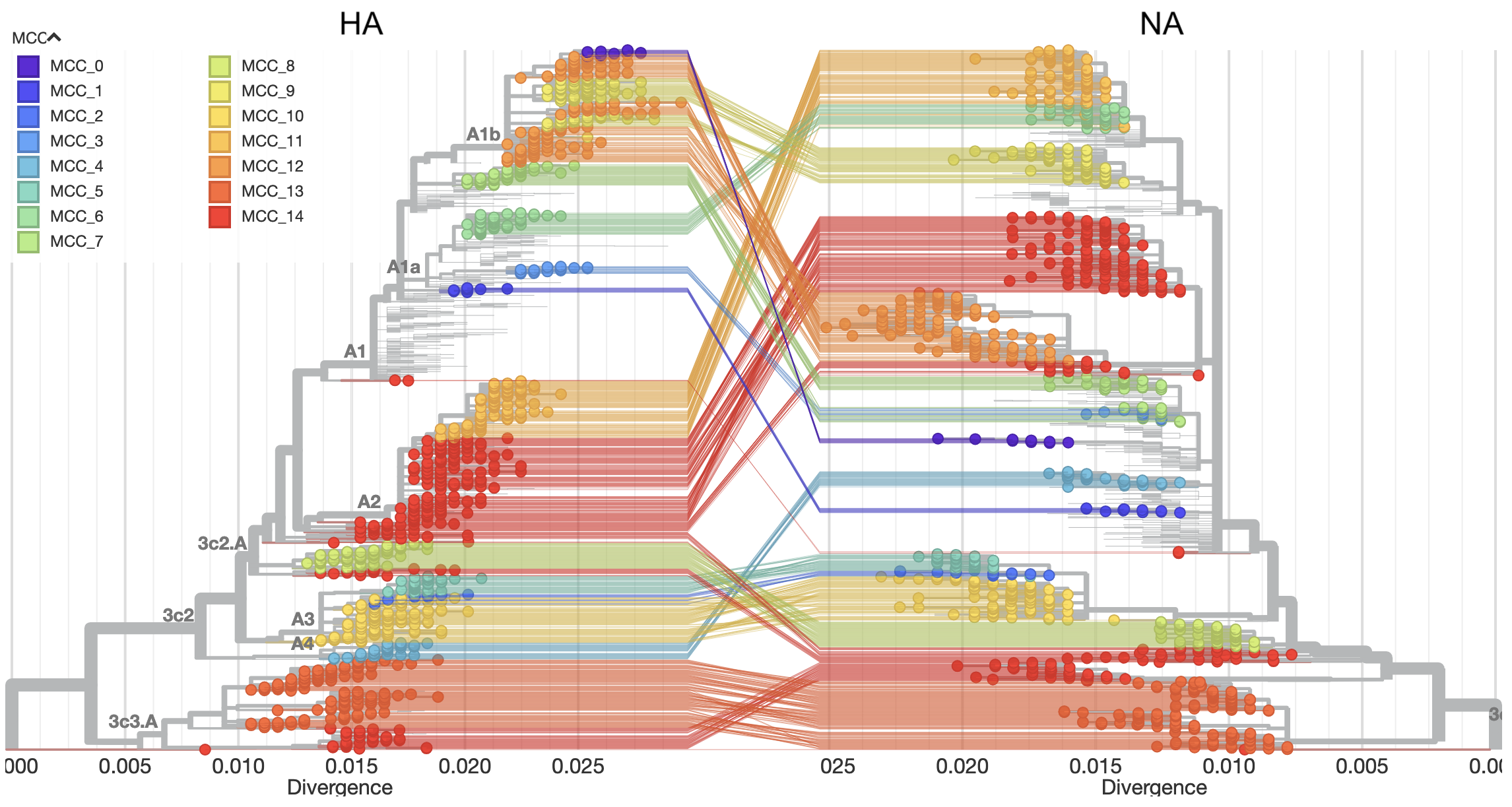
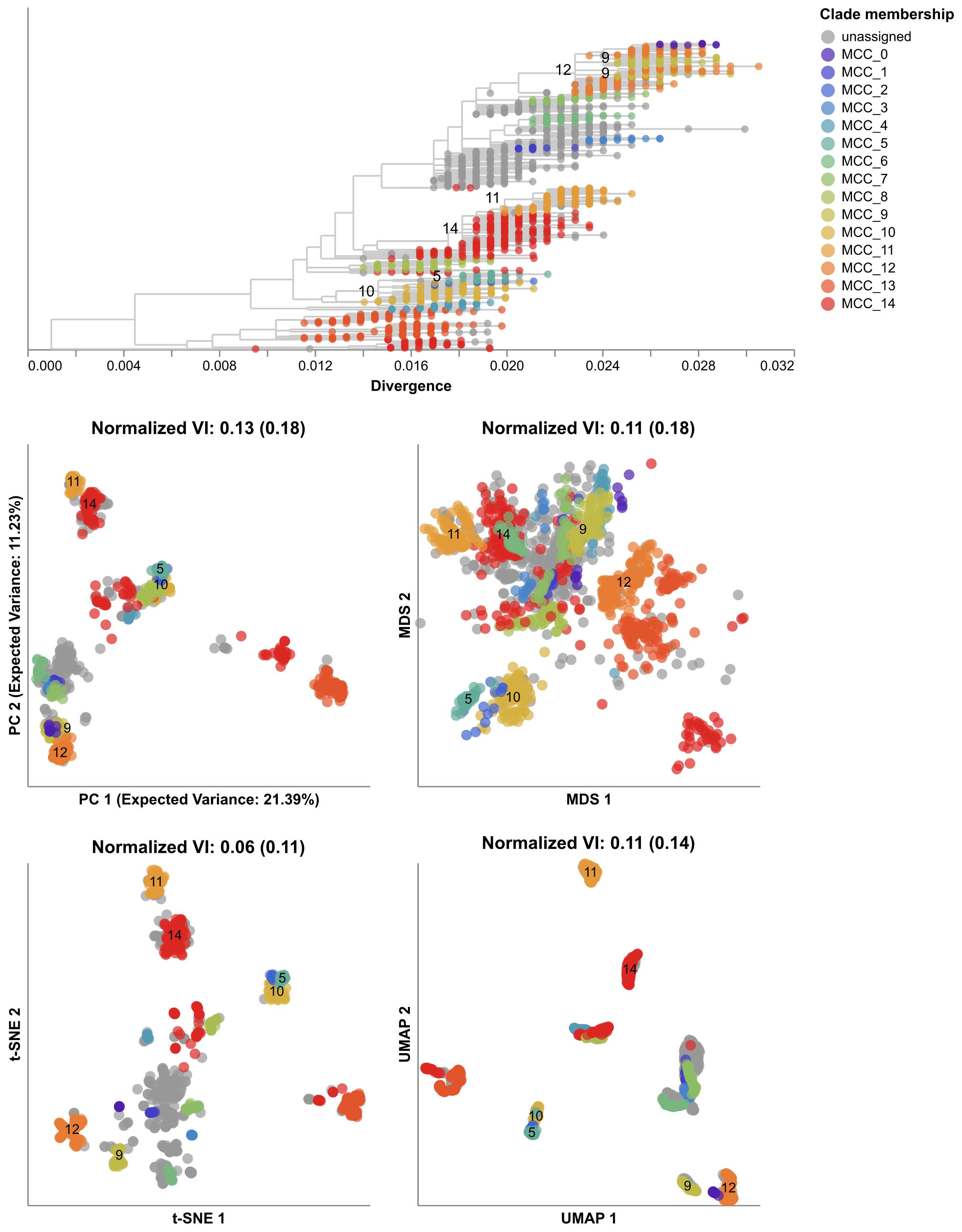
Next, we made maps for the seasonal flu pieces HA and NA, automatically found groups in each map, and calculated the distance between the groups we found and the groups from TreeKnit. We found that the groups from these simple map-based methods often closely matched the groups found by the more sophisticated TreeKnit program, with t-SNE groups being especially good (Figure 7). These results suggested that we could use these simple methods to find meaningful groups of viruses using information from all viral pieces.
Five years after starting this project, Sravani is now a senior in University of Washington’s Computer Science program. She has presented her work on this project at her first international research conference in Italy, and she has published this work in her first lead-author scientific manuscript in the journal Virus Evolution. We now routinely make maps of seasonal flu viruses in our weekly Nextstrain analyses (for example, see today’s results for H3N2) to look for new groups of viruses that might become more successful at infecting people. We have also begun to apply these maps to recent flu viruses collected from birds and cows where viruses with multiple parents tend to be better at jumping into new hosts. We still have a lot of questions about how to apply these maps to different viruses or bigger datasets, but we’ve learned a lot already from a project that started as a 2-month internship led by a motivated and dedicated young researcher.
To learn more about this project, read Sravani’s paper and explore the interactive views of our maps for flu and SARS-CoV-2 on Nextstrain and our interactive figures on GitHub.